Archives
- Newer posts
- April 2026
- November 2025
- October 2025
- September 2025
- August 2025
- July 2025
- June 2025
- May 2025
- November 2024
- April 2024
- November 2023
- October 2023
- August 2023
- May 2023
- February 2023
- October 2022
- August 2022
- July 2022
- May 2022
- April 2022
- March 2022
- February 2022
- June 2020
- March 2020
- February 2020
- January 2020
- December 2019
- November 2019
- October 2019
- September 2019
- August 2019
- July 2019
- June 2019
- May 2019
- April 2019
- March 2019
- February 2019
- January 2019
- December 2018
- November 2018
- October 2018
- September 2018
- August 2018
- July 2018
- June 2018
- May 2018
- April 2018
- March 2018
- February 2018
- January 2018
- December 2017
- November 2017
- October 2017
- September 2017
- August 2017
- July 2017
- June 2017
- May 2017
- April 2017
- March 2017
- February 2017
- January 2017
- August 2016
- June 2016
- April 2016
- March 2016
- February 2016
- January 2016
- July 2015
- June 2015
- Older posts

CSS Animation Using Keyframes
Most websites nowadays use animations. Animation on the website enhances the website’s look and creates an interactive platform for the users. CSS animations can be in the form of GIFs, SVGs, background videos, etc.
CSS animations can be used to animate css style property. An Animation contains two elements: a block of CSS and a group of keyframes that indicate the beginning and end state of the animation’s style.
Animations have evolved over time, and listed below are the three key benefits of CSS animations over ancient script-driven animation techniques:
- Using animations without the help of JavaScript.
- The animations run well, even under moderate system load. Straight-forward and simple animations will typically perform poorly in JavaScript. Therefore, frame-skipping and alternative techniques are used by the rendering engine to achieve better performance.
- The browser manages the animation sequence and optimises performance and productivity. This is how the browser reduces the update frequency of animations running in tabs that are not in use.
To create a CSS animation sequence, you conceptualise and design what you would like to animate with the animation property. This allows you to set up the time sequence, duration, and alternative details of how you want the animation to run. This configuration has no link to the actual look of the animation. This can be achieved by using or defining @keyframes.
ALSO READ: The Smart Way To Write CSS
Following are the attributes of an animation property:
animation-name
Describes the name of the animation, @keyframes at-rule, depicting the activity’s keyframes.
animation-duration
Specifies the duration taken to complete the animation.
animation-timing-function
Configures the duration of the animation: How the animation transitions through keyframes by establishing acceleration curves.
animation-delay
Configures the delay between the time on the loaded part and the start of the animation sequence.
animation-iteration-count
Configures the amount of time the animation ought to repeat; you will need to specify infinite to repeat the animation indefinitely.
animation-direction
Configures whether the animation should alternate direction on every run through the sequence or reset to the beginning purpose and repeat itself.
animation-fill-mode
Configures what unit is applied by the animation before and once it is executed.
animation-play-state
Allows you to pause and resume the animation sequence.
CSS animations are definitely not only better from an optimisation perspective, but they also provide a bit more control as they allow for the creation of multiple keyframes over which the animation occurs.
Example:
HTML:

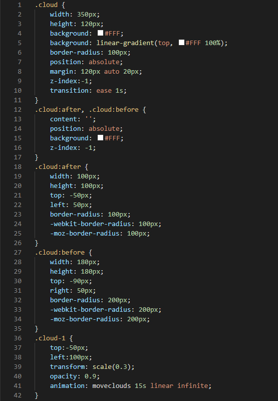
CSS:

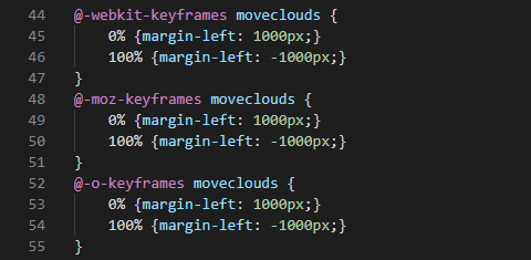
CSS Keyframes:

